WEB DESIGN
Soline
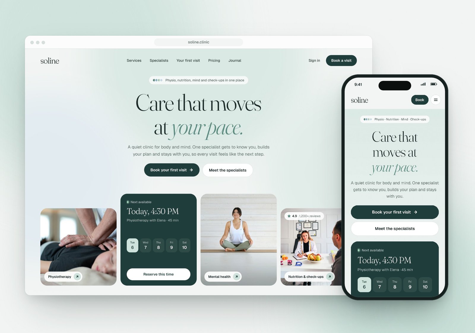
A landing page for Soline, a health and wellness clinic in San Francisco that brings physiotherapy, mental health, nutrition and check-ups into one plan. Designed for desktop and mobile with a calm sage palette, soft serif type and a booking card right in the hero, so the page feels as quiet and reassuring as the clinic itself.
The challenge
Clinic websites tend to fall into two camps: cold and clinical, or so busy with offers that they feel like a sales page. Neither helps someone who is already in pain or worried about their health. They want to know three things quickly: can these people help me, who will I see, and how soon can I get in?
Soline offers four kinds of care under one roof, which is its biggest strength and also the hardest thing to explain. The challenge was to make "one team, one plan" clear in a few seconds, make booking feel easy rather than pushy, and keep the whole page calm enough that visitors feel looked after before they even arrive.
Our approach
Booking in the hero. The first screen answers the most important question straight away. A "Next available" card shows today's slot, the specialist's name and a row of days, so booking feels like picking a time, not filling in a form. Real photos of each service sit beside it, so people see the care before they read about it.
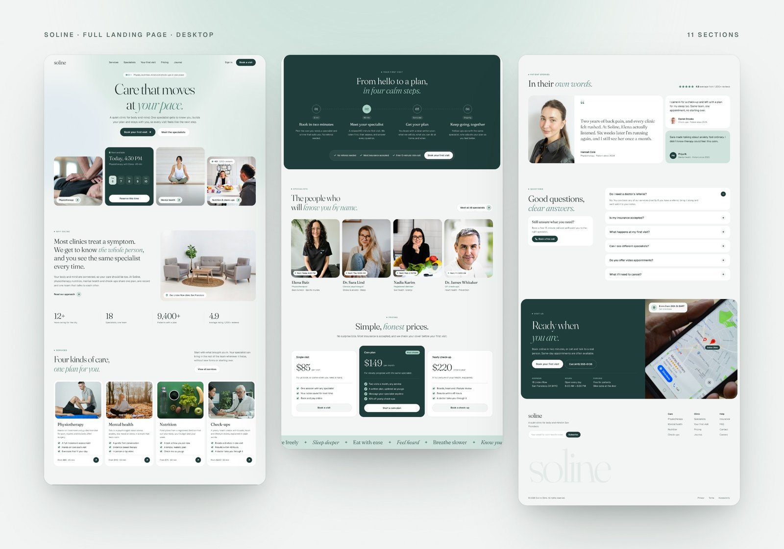
One plan, explained simply. The page tells one story from top to bottom: why Soline is different, the four kinds of care, what happens at the first visit in four calm steps, the specialists by name, and honest prices. Each section answers the next question a nervous first-time patient would ask.
People, not services. Specialists are shown with friendly portraits, their focus areas and their next free time. Patient stories use first names and real-sounding details, and the FAQ handles the worries that stop people booking, like referrals, insurance and cancelling.
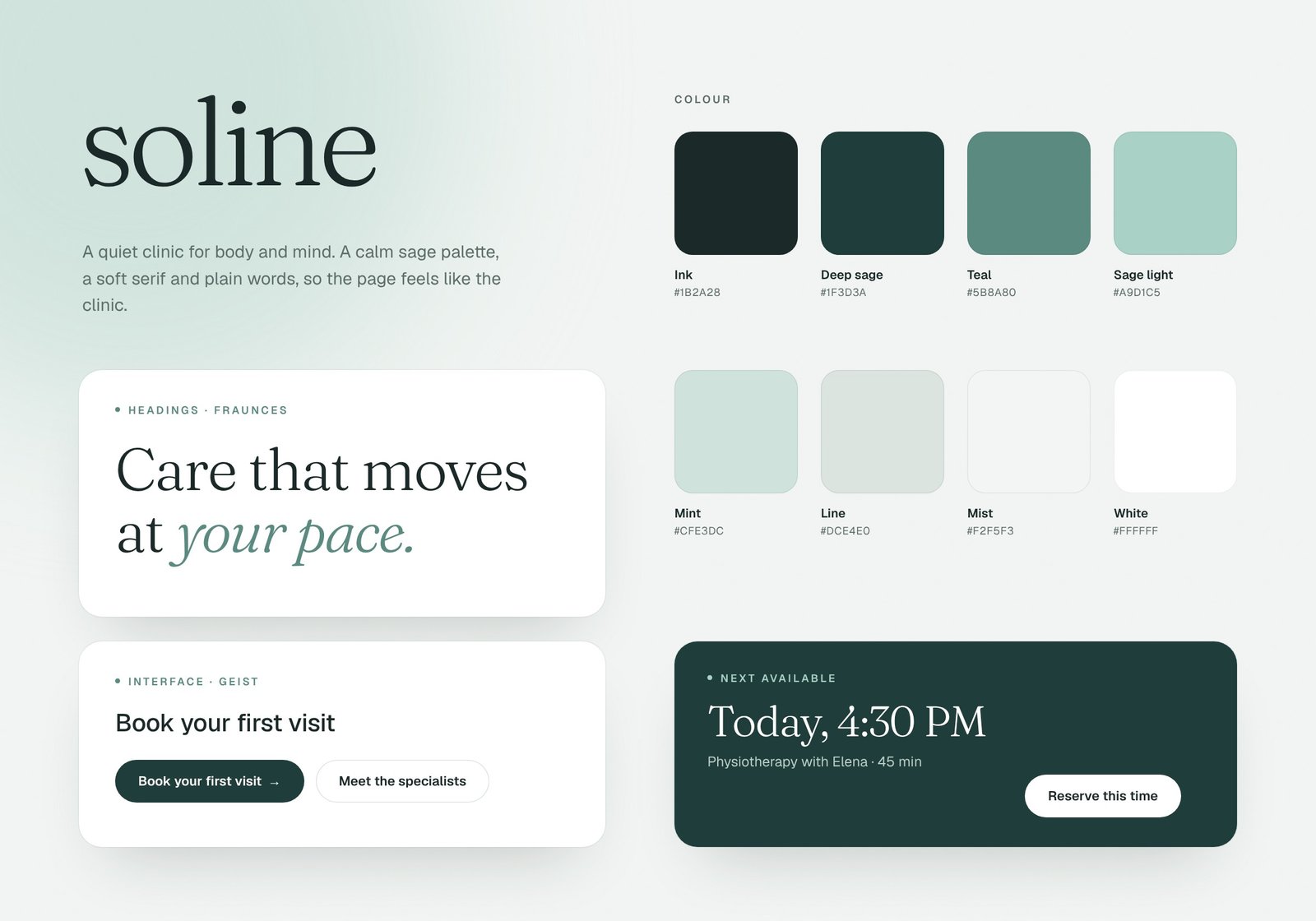
A pure, peaceful palette. We kept warm colours out on purpose. Deep sage, soft teal, mint and a misty off-white make the page feel fresh and quiet. Fraunces, a soft serif with italic accents, gives headings a human touch, and Geist keeps the interface clear and easy to read.
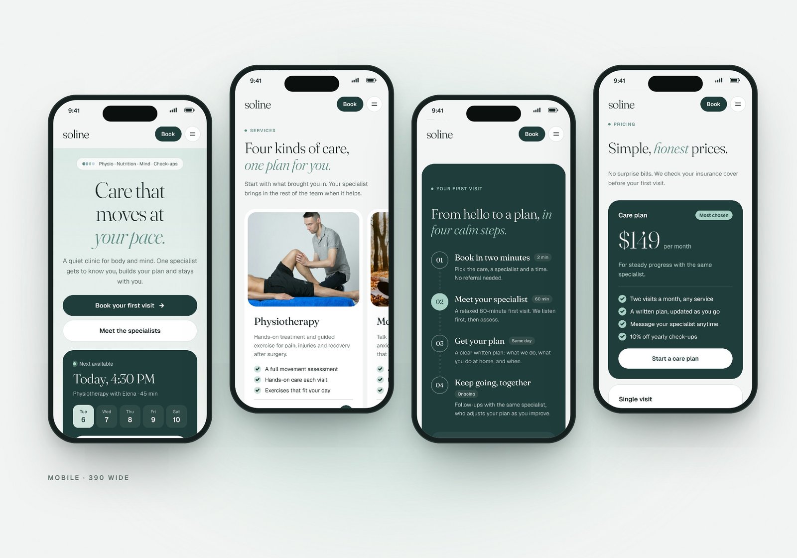
Designed for mobile from the start. On the phone, the booking card comes right after the headline, services and specialists swipe sideways, the first-visit steps run down a dashed line, and the most-chosen care plan moves to the top of pricing. Every section was rebuilt for one hand, not just shrunk.
The outcome
A complete landing page for desktop (1440) and mobile (390) with eleven sections: hero with live booking, why Soline, services, first visit, specialists, pricing, a gentle ticker, patient stories, FAQ, visit us with a map, and a footer.
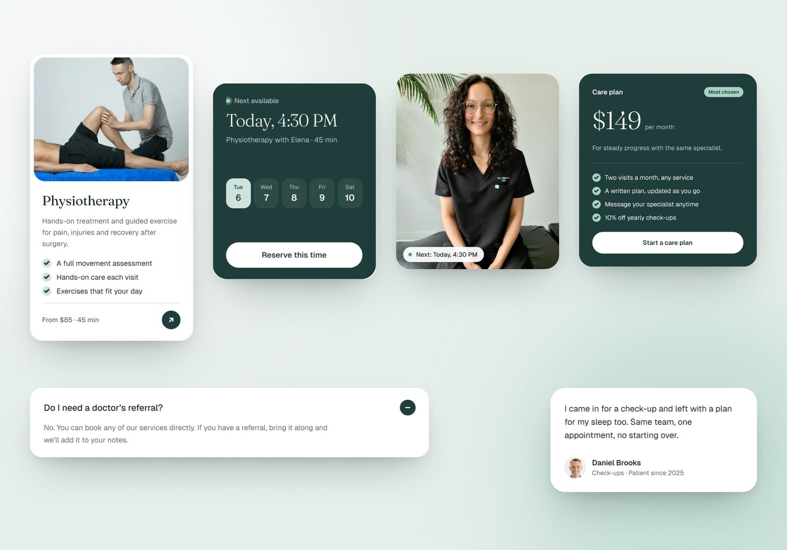
The design is built from a small set of reusable pieces, including service cards, specialist cards, pricing cards, FAQ items and pill buttons, so new pages stay consistent. The result feels calm, trustworthy and easy to act on, the way a good clinic should.
- 11
- Sections designed
- 2
- Layouts: desktop & mobile
- 4
- Kinds of care in one plan
- 8
- Colours in a calm sage palette
Next project
Have a project
in mind?
Tell us what you're building. We'll get back to you within one business day.
Start a project