APP DESIGN
Fintra
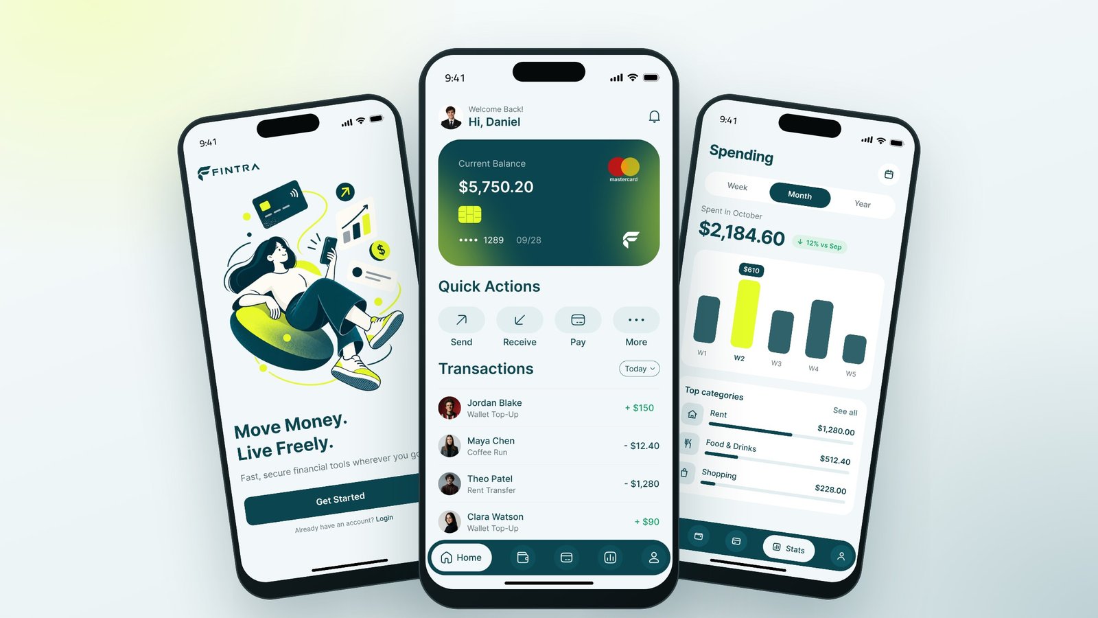
A mobile banking app that makes everyday money simple: log in with a glance, send money to friends in seconds, control your cards and see where your money goes. Nine screens, one clear payment story and a fresh teal and lime brand.
The challenge
Banking apps often feel heavy: too many menus, small print and steps that make simple things like paying a friend feel risky.
Fintra needed an app that feels light and modern for everyday money, while still feeling safe enough to trust with a salary. The key flow, sending money, had to be fast, but also impossible to trigger by accident.
Our approach
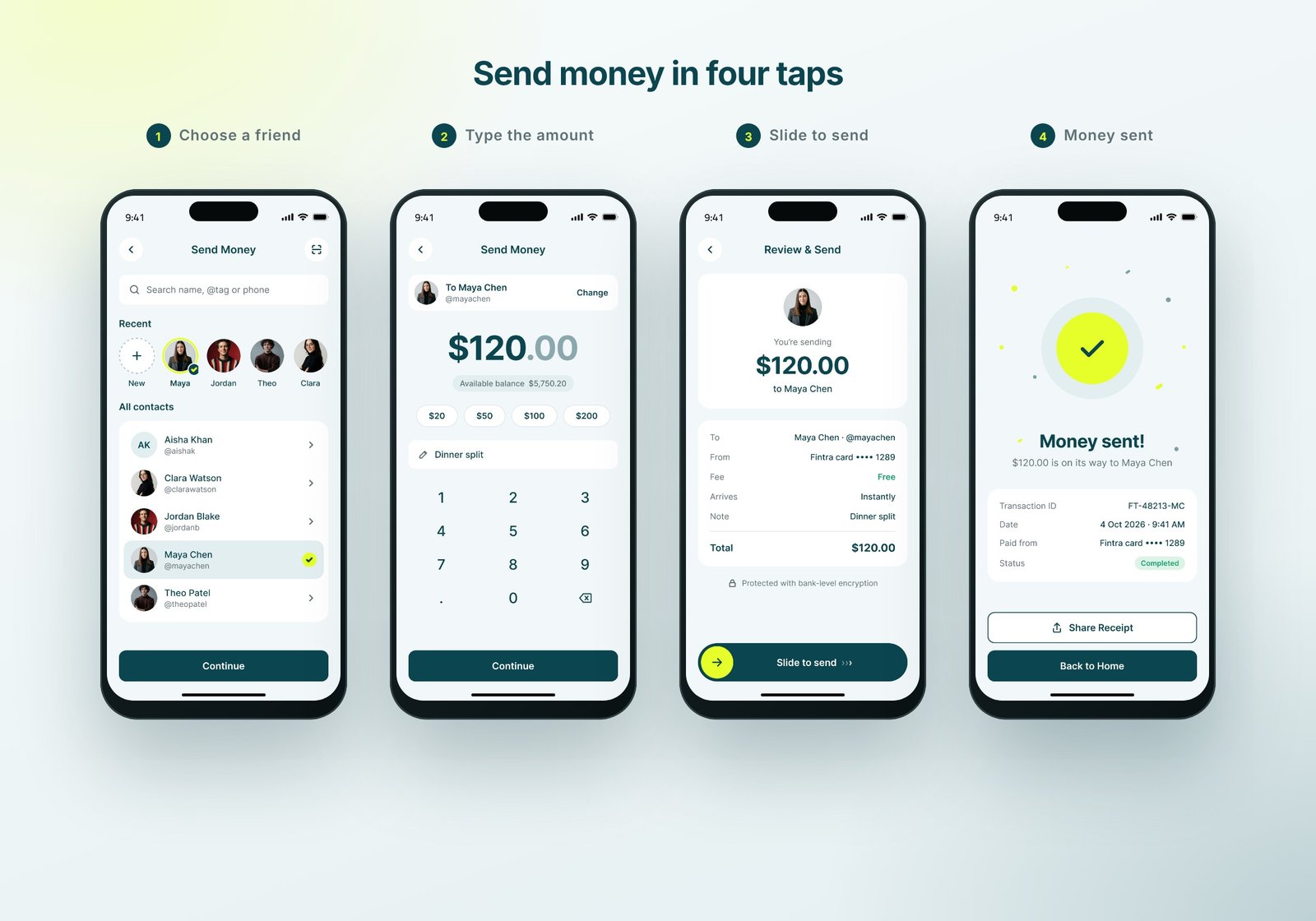
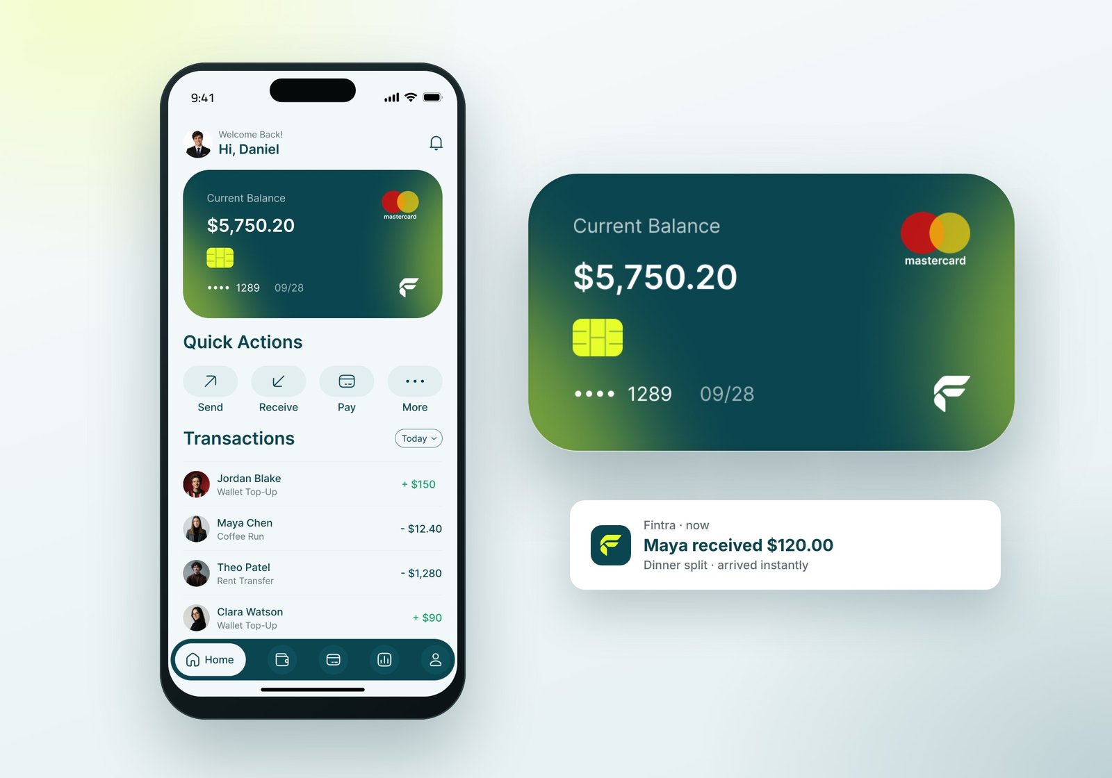
One clear story. We designed the app around one everyday moment: Daniel sends $120 to his friend Maya for dinner. Every screen supports that story, from Face ID login to the receipt, the updated balance and the new transaction on the home screen.
Fast, but safe. Sending money takes four taps: choose a friend, type the amount, review, and slide to send. The slide gesture is a deliberate final step, so payments are never sent by mistake, and the review screen shows the fee and arrival time before anything moves.
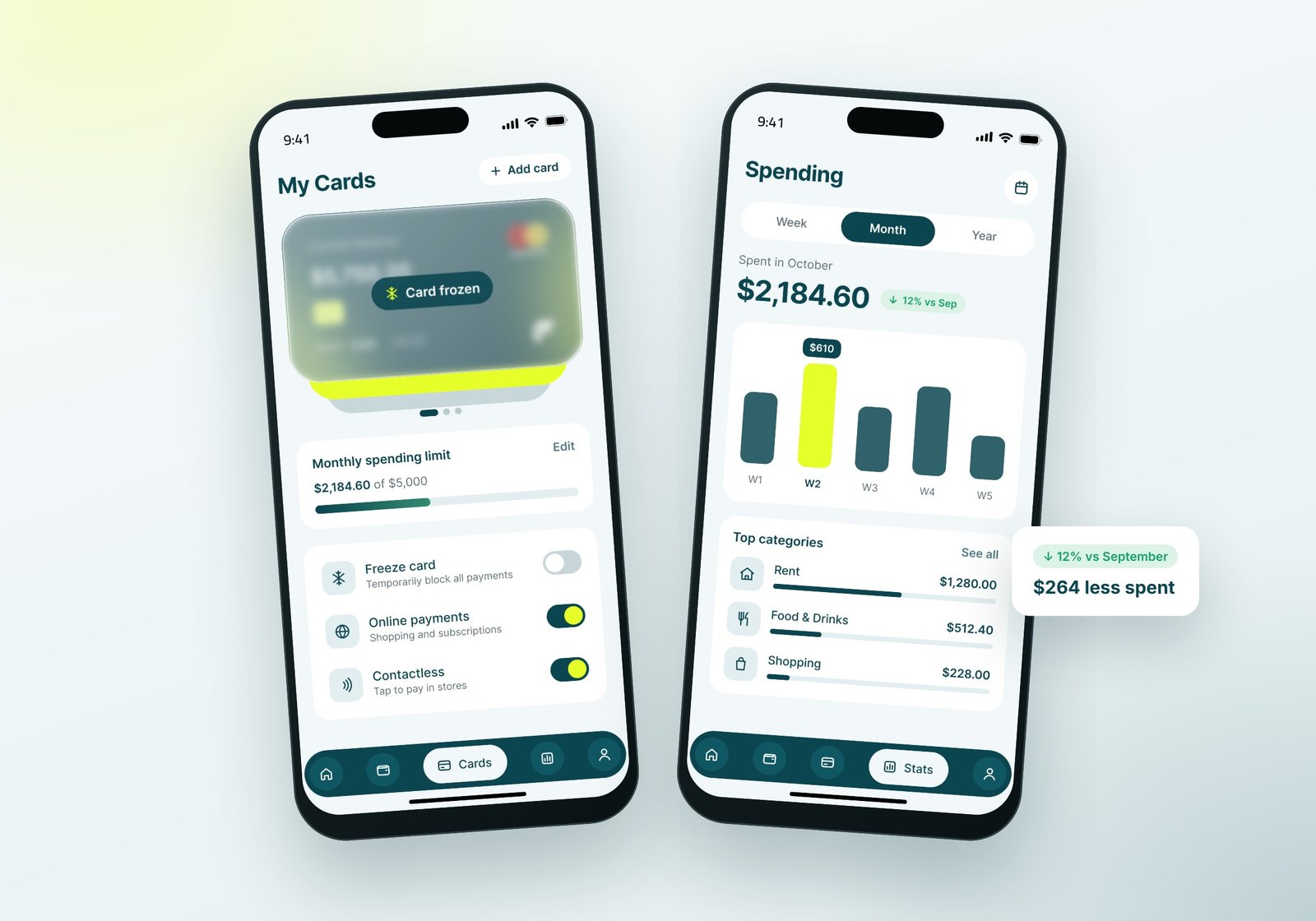
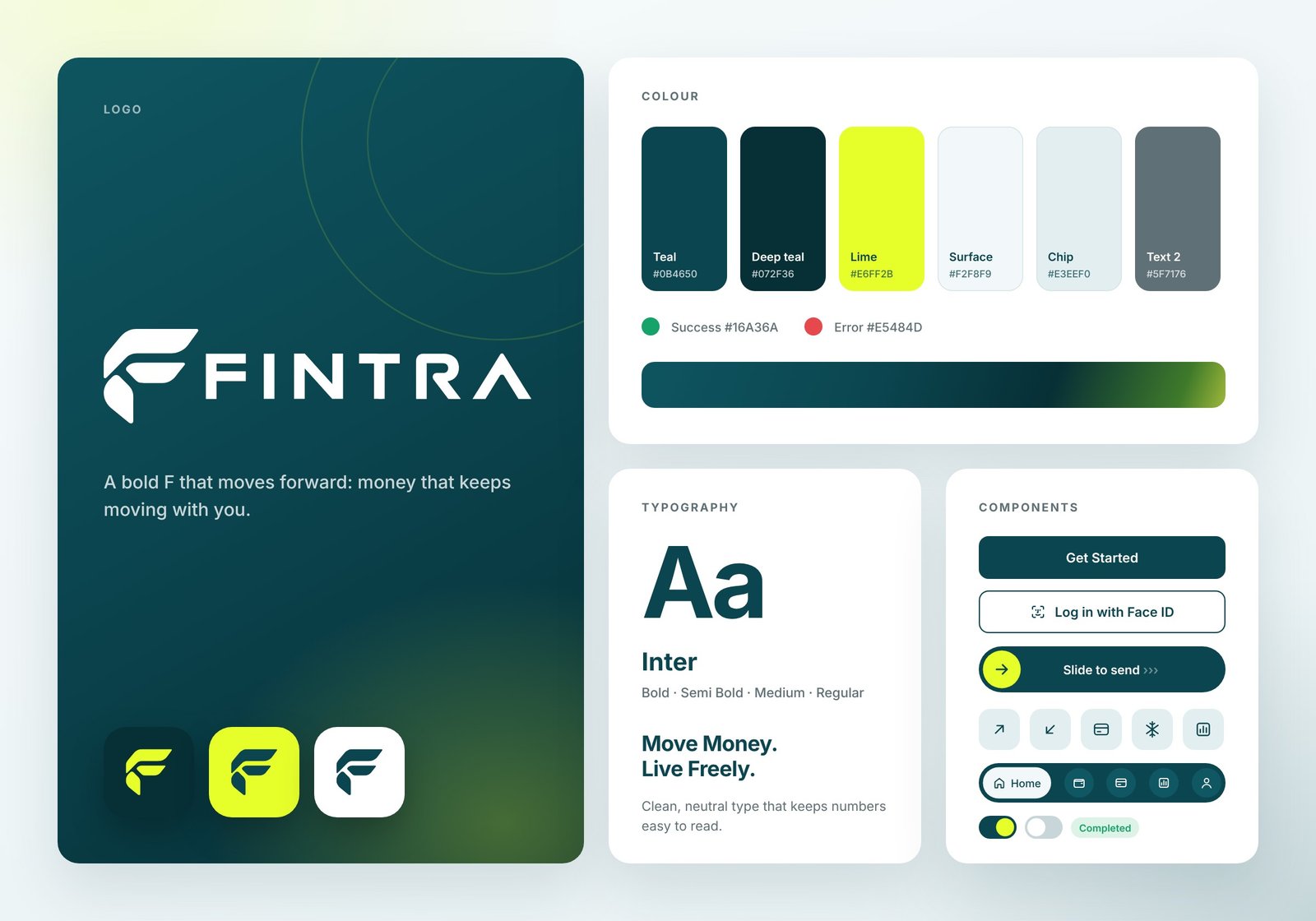
A calm teal with a confident lime. Deep teal carries the trust a money app needs. Neon lime is used sparingly for the moments that matter: the selected friend, the send handle, the success check and the highest bar in the spending chart.
Control in one tap. The Cards screen lets people freeze a card instantly, switch online and contactless payments on or off, and track their monthly limit. The Spending screen turns transactions into a simple weekly chart and top categories.
A system, not just screens. One typeface (Inter), a six-colour palette, shared buttons, toggles, chips and a floating tab bar keep all nine screens consistent and ready to grow.
The outcome
A complete mobile app design: splash, login, home, a four-step send flow with success state, card controls and spending analytics, plus a brand kit with logo, colours, typography and components.
The numbers stay consistent across every screen, so the prototype feels like a real product: the same card, the same balance and the same $120 payment from start to finish.
- 9
- Screens designed
- 4
- Taps to send money
- 6
- Brand colours
- 1
- Shared design system
Next project
Have a project
in mind?
Tell us what you're building. We'll get back to you within one business day.
Start a project