BRAND IDENTITY
Dawnhearth Coffee
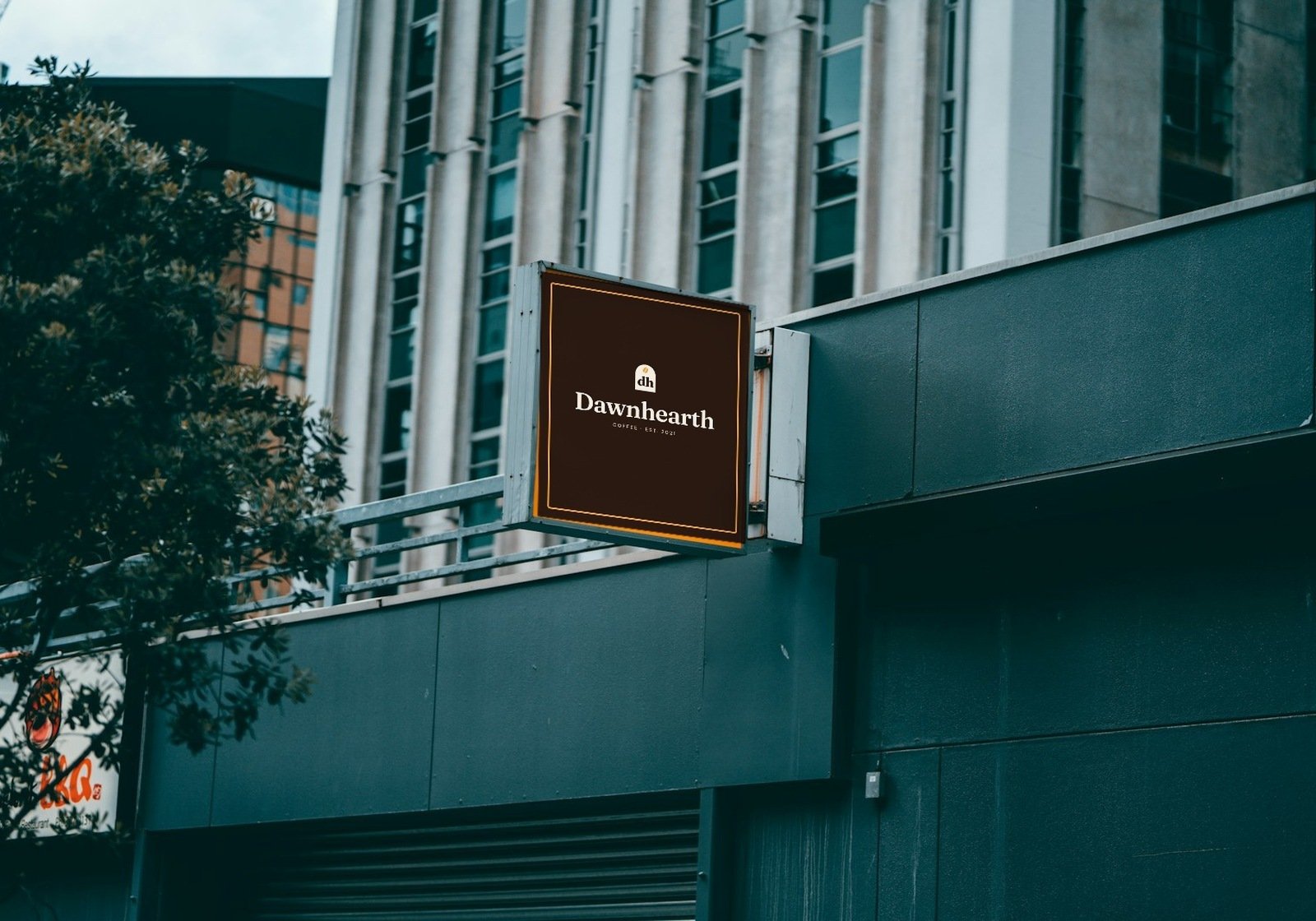
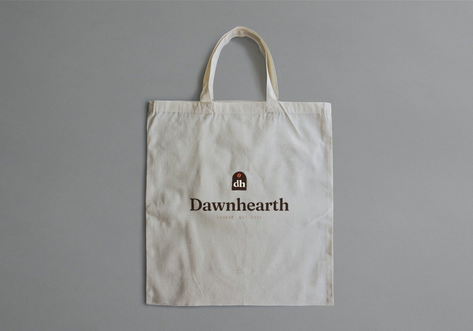
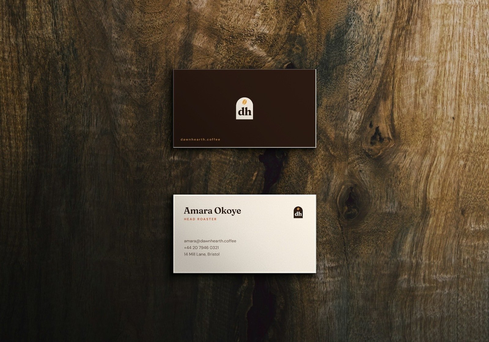
Brand identity for Dawnhearth, a small-batch coffee roaster: logo, colour, type, pattern, packaging, cups, signage and print.
The challenge
Dawnhearth roasts its beans in small batches every morning. It needed an identity that felt warm and crafted without falling back on the usual coffee clichés of steaming cups and rising suns.
The brand had to work at every size: a favicon, a stamp on a paper cup, a bag on a shelf and a sign on a street corner. It also had to make three different roasts easy to tell apart at a glance.
Our approach
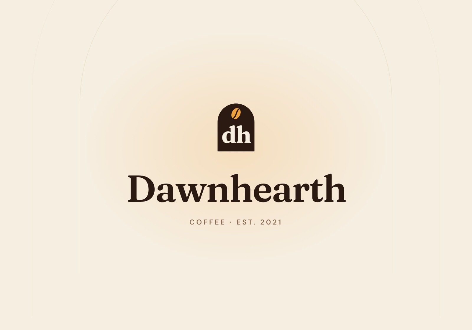
The logo started with the name. A hearth is a warm, arched fireplace, like the mouth of a roasting oven. We set the "dh" monogram inside that arch and placed a single roasted bean at the top.
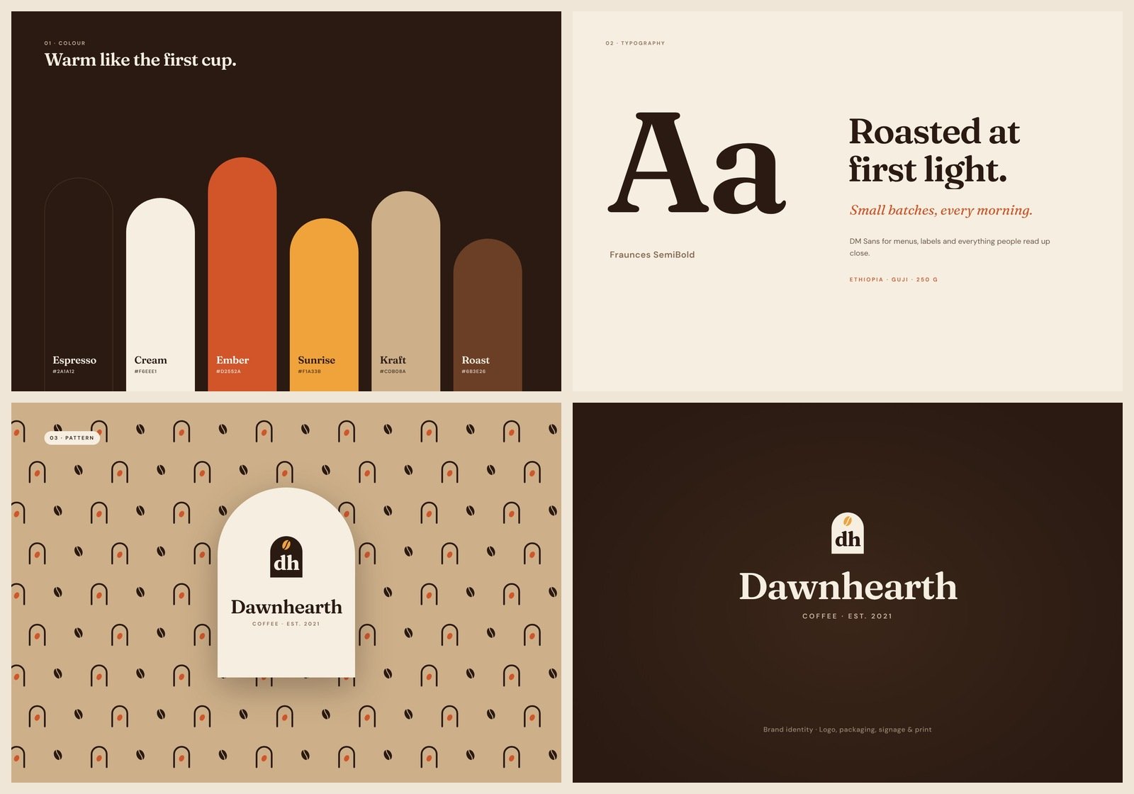
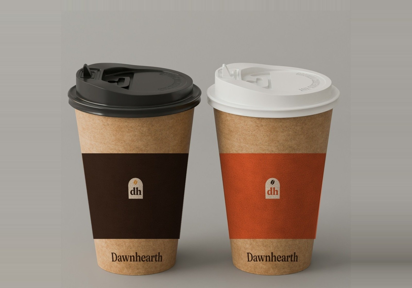
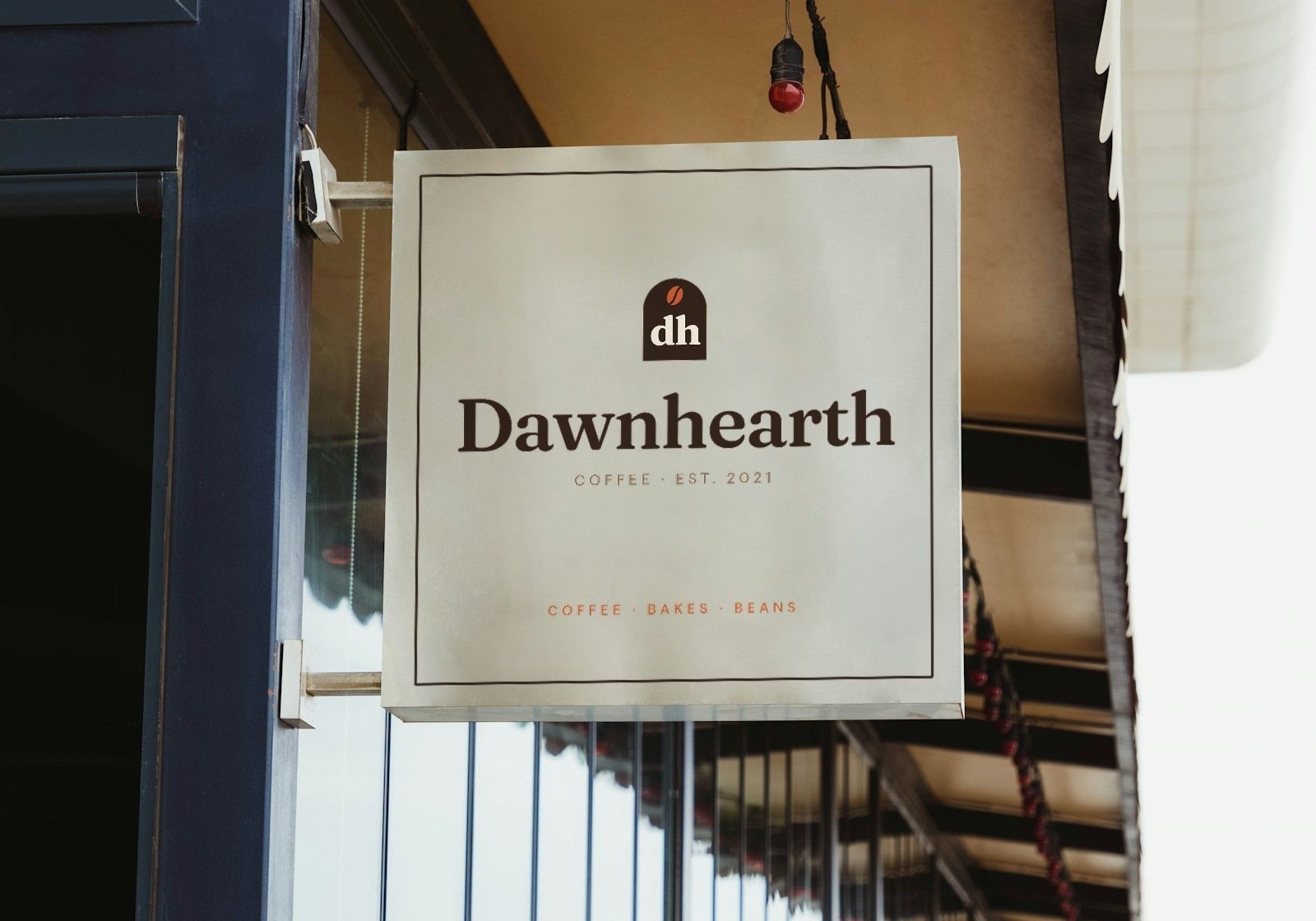
The arch became the system: it shapes the bag labels, the shop sign, the menu board and the stickers. The bean became a repeat pattern for packaging and cup sleeves.
Colour: espresso and cream carry the brand, ember is the spark, and sunrise amber is a nod to "dawn".
Type: Fraunces gives headlines a crafted, slightly old-world warmth; DM Sans keeps labels and menus clear.
Packaging: each roast has its own colour (sunrise for light, ember for medium, espresso for dark) with a three-bean roast scale on every bag, so customers can choose without reading.
The outcome
A complete, flexible identity built on one simple shape. The arch shows up everywhere, from a 16px favicon to a full shop sign, so the brand is recognisable even without the name. The system is set up in Figma with colour variables, logo components, pattern tiles and usage rules, ready for a printer or a web designer to pick up.
- 1
- Arch shape across the whole brand
- 3
- Roasts, colour-coded
- 7
- Colours in the palette
- 12+
- Brand touchpoints designed

Next project
Have a project
in mind?
Tell us what you're building. We'll get back to you within one business day.
Start a project