APP DESIGN
Kaivoy
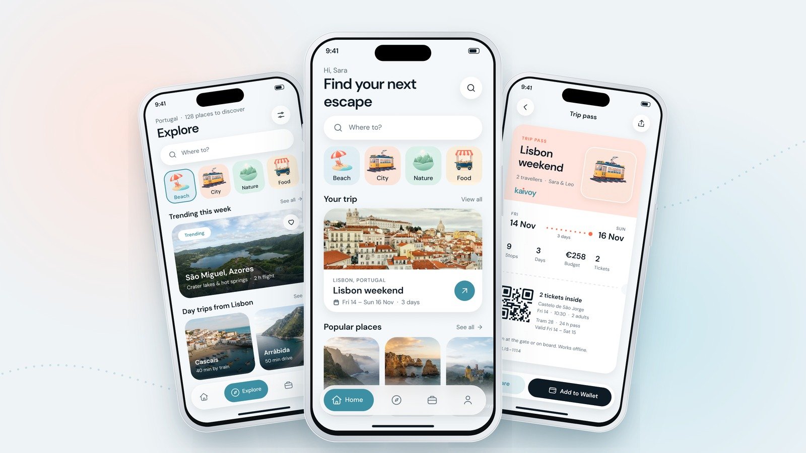
A travel planning app that turns a mood into a real plan: pick a feeling, compare places at a glance, build a day stop by stop and carry everything in one pass. Nine screens, one Lisbon weekend and a calm lagoon and coral brand.
The challenge
Planning a trip usually means juggling ten tabs: a map, a booking site, saved posts, a notes app and a spreadsheet. Most travel apps add to the noise with busy screens, banners and deals, so the fun part of travel turns into admin.
Kaivoy needed to feel calm and inspiring at the start, when you only know the kind of trip you want, and practical at the end, when you need times, routes and tickets in your pocket. It had to get people from "somewhere warm" to a real day plan without ever feeling like a form.
Our approach
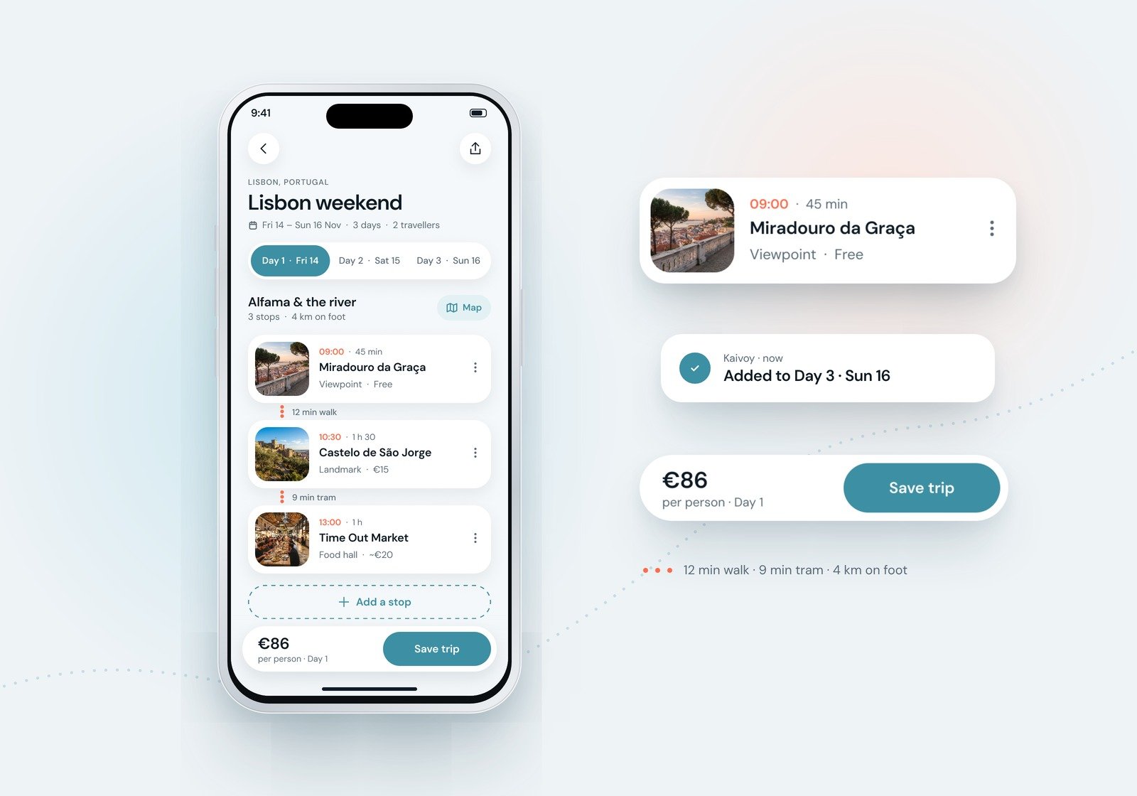
One trip, start to finish. We designed every screen around one story: Sara plans a weekend in Lisbon, Friday 14 to Sunday 16 November. The same trip, dates, stops and budget run from the home screen to the map and the final pass.
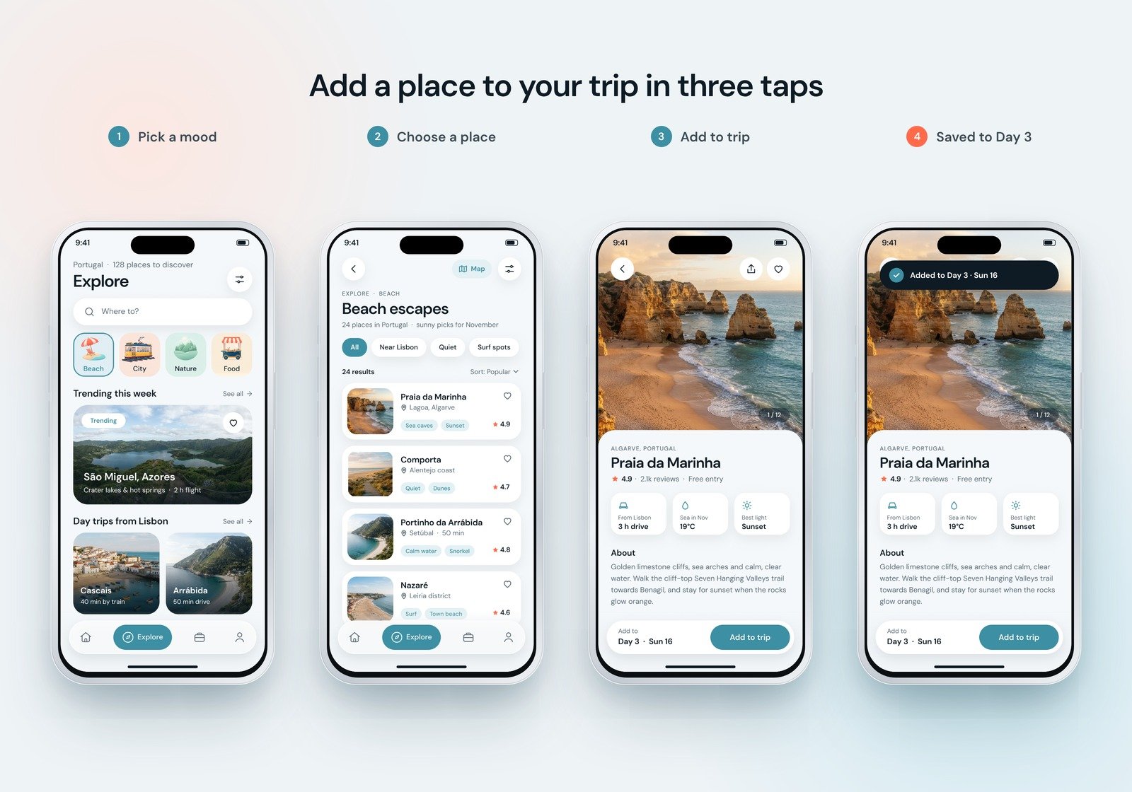
From a mood to a plan in three taps. Pick a category such as Beach, choose a place from the results and tap Add to trip. Kaivoy drops it straight into the right day, so inspiration becomes a plan before it is forgotten.
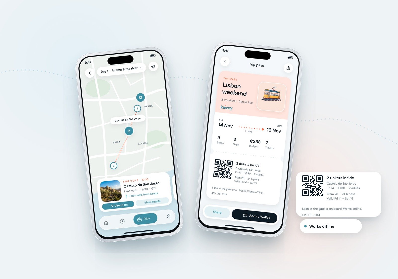
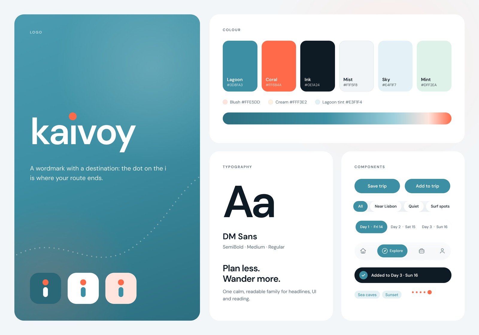
A route you can follow. The dotted coral route is the brand's signature. It links the stops in the trip builder, guides you on the map, connects the dates on the pass and ends at the dot on the i in the logo.
Calm, photo-first and readable. Real-looking places do the inspiring, and soft shaded illustrations mark the categories. Text never sits on a busy photo without a gradient behind it, and everything else lives on clean white cards set in DM Sans.
A system, not just screens. One typeface, a lagoon and coral palette, shared cards and chips, a frosted floating tab bar and a rounded line icon set keep all nine screens consistent and ready to grow.
The outcome
A complete travel app concept: splash, home, explore, results, destination detail, a day-by-day trip builder, map view, an offline trip pass and saved places, plus a brand kit with logo, app icon, colour, typography, illustration and icons.
Because one trip runs through every screen, the prototype feels like a real product: the beach Sara saves from the results is the one waiting for her on day three.
- 9
- Screens designed
- 3
- Taps to send money
- 4
- Illustrated Categories
- 1
- Shared design system
Next project
Have a project
in mind?
Tell us what you're building. We'll get back to you within one business day.
Start a project