PRODUCT DESIGN
Meguru
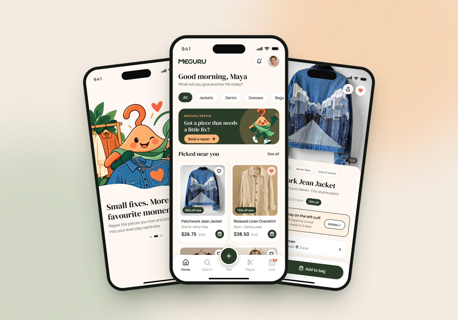
A mobile app for pre-loved fashion that lets people buy second-hand clothes, book a local tailor to fix them, and sell what they no longer wear. Thirteen screens, one connected story, and a warm illustrated brand that makes giving clothes a second life feel easy and personal.
The challenge
Second-hand apps make it easy to buy and sell, but they stop at the transaction. When a piece has a loose button or a frayed cuff, people either skip it or buy it and never get round to fixing it, so good clothes still end up unworn.
Meguru set out to connect the whole life of a piece in one app: find it, fix it, and pass it on. The challenge was to fit buying, repair and reselling together without making the app feel heavy, and to make honest details like a "minor flaw" feel reassuring rather than off-putting.
Our approach
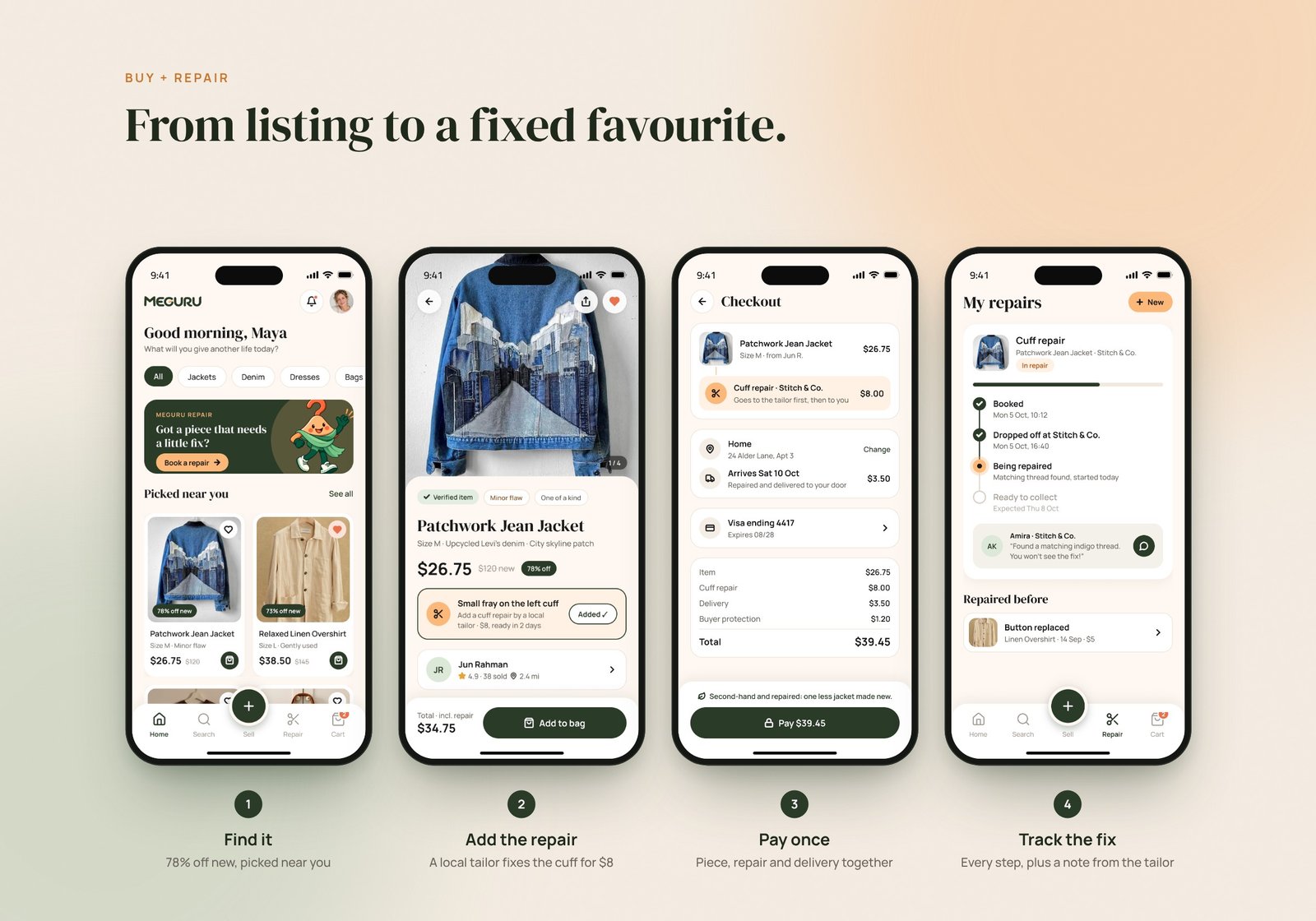
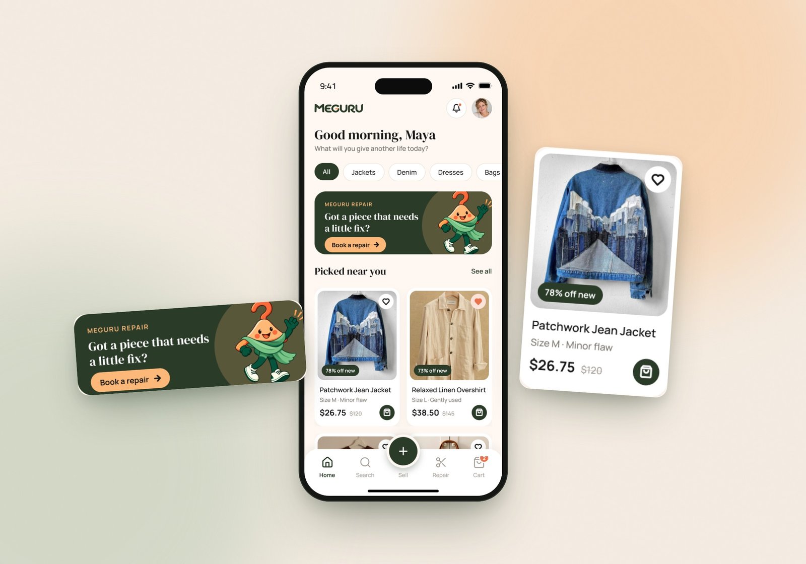
Repair built into buying. Repair isn't a separate corner of the app. When a listing has a small flaw, the product page offers a local tailor's fix with a fixed price and ready date, and it rides along in the same checkout. The item visits the tailor first, then arrives at the buyer's door.
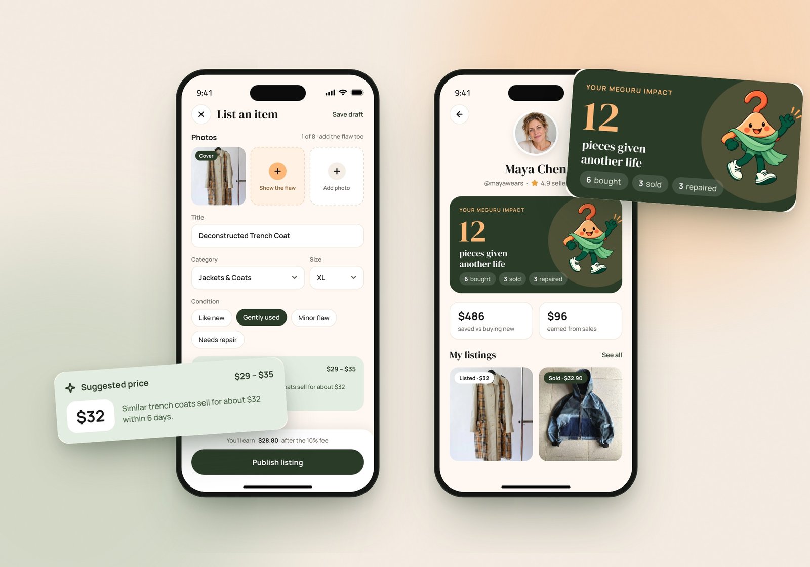
One story, end to end. Every screen follows one everyday journey: Maya finds a patchwork jean jacket with a frayed cuff, adds an $8 repair, pays once, follows the repair step by step, and later lists her own trench coat. Prices, dates and totals match from screen to screen, so the prototype reads like a real product.
Honest by design. Every card shows the real saving against buying new, condition is always visible, and the sell flow asks people to photograph the flaw too. A suggested price based on similar pieces takes the guesswork out of listing.
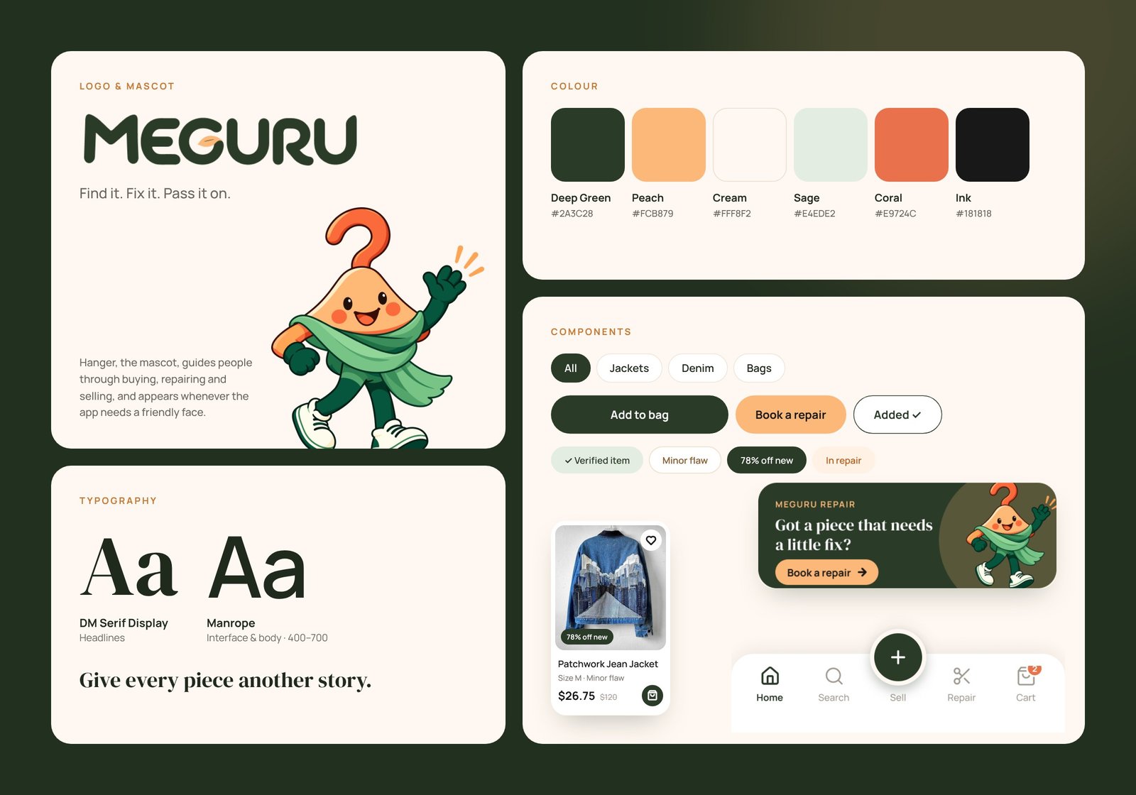
A warm, illustrated brand. Deep green and cream keep the interface calm and premium, peach highlights the moments that matter, and Hanger, the mascot, adds personality from onboarding to the impact screen. A simple rule keeps it consistent: green for actions, peach for highlights.
The outcome
A complete mobile app concept with 13 screens across three connected flows: buying, repair and selling, plus onboarding, sign-up, search and a personal impact profile.
The design is built on a small component system (product cards, chips, badges, buttons and a tab bar with a central Sell button) so new screens stay consistent. The result feels friendly and trustworthy, and turns a familiar resale app into one that helps clothes stay in use for longer.
- 13
- Screens designed
- 3
- Connected flows: buy, repair, sell
- 6
- Brand colours
- 1
- Mascot & component system
Next project
Have a project
in mind?
Tell us what you're building. We'll get back to you within one business day.
Start a project