WEB DESIGN
Cashola
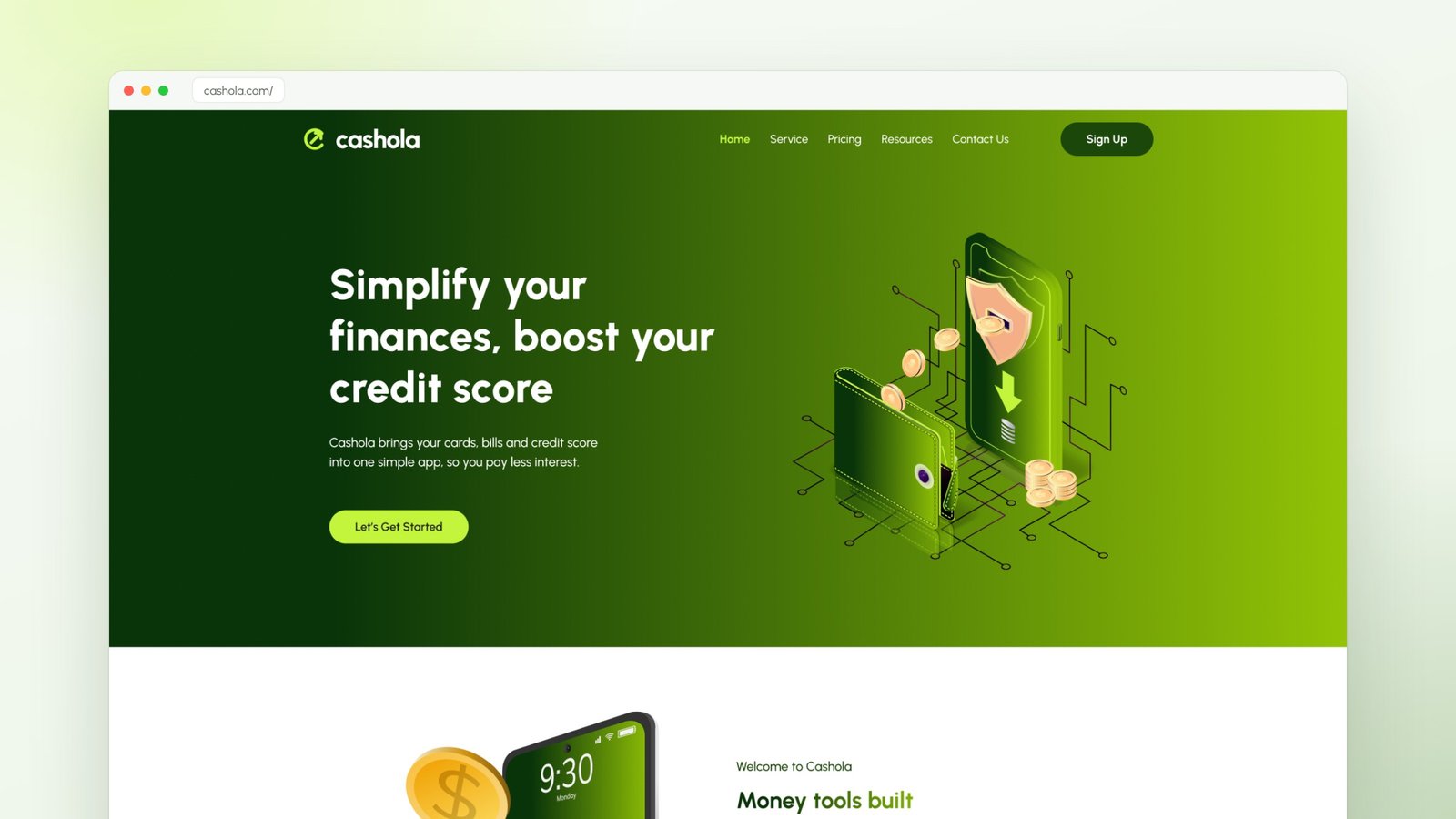
A marketing website and brand refresh for Cashola, a credit-building app that helps people organise their cards, pay less interest and raise their credit score. Five pages, one clear story, and a fresh green identity that makes money feel calm instead of stressful.
The challenge
Credit is confusing and a little scary for most people. Statements are hard to read, interest adds up quietly, and the advice online is full of jargon.
Cashola needed a website that would make a money app feel friendly and trustworthy. In a few seconds it had to explain what the product does, show that it is safe, and move visitors to start a free trial, without looking like every other blue banking site.
Our approach
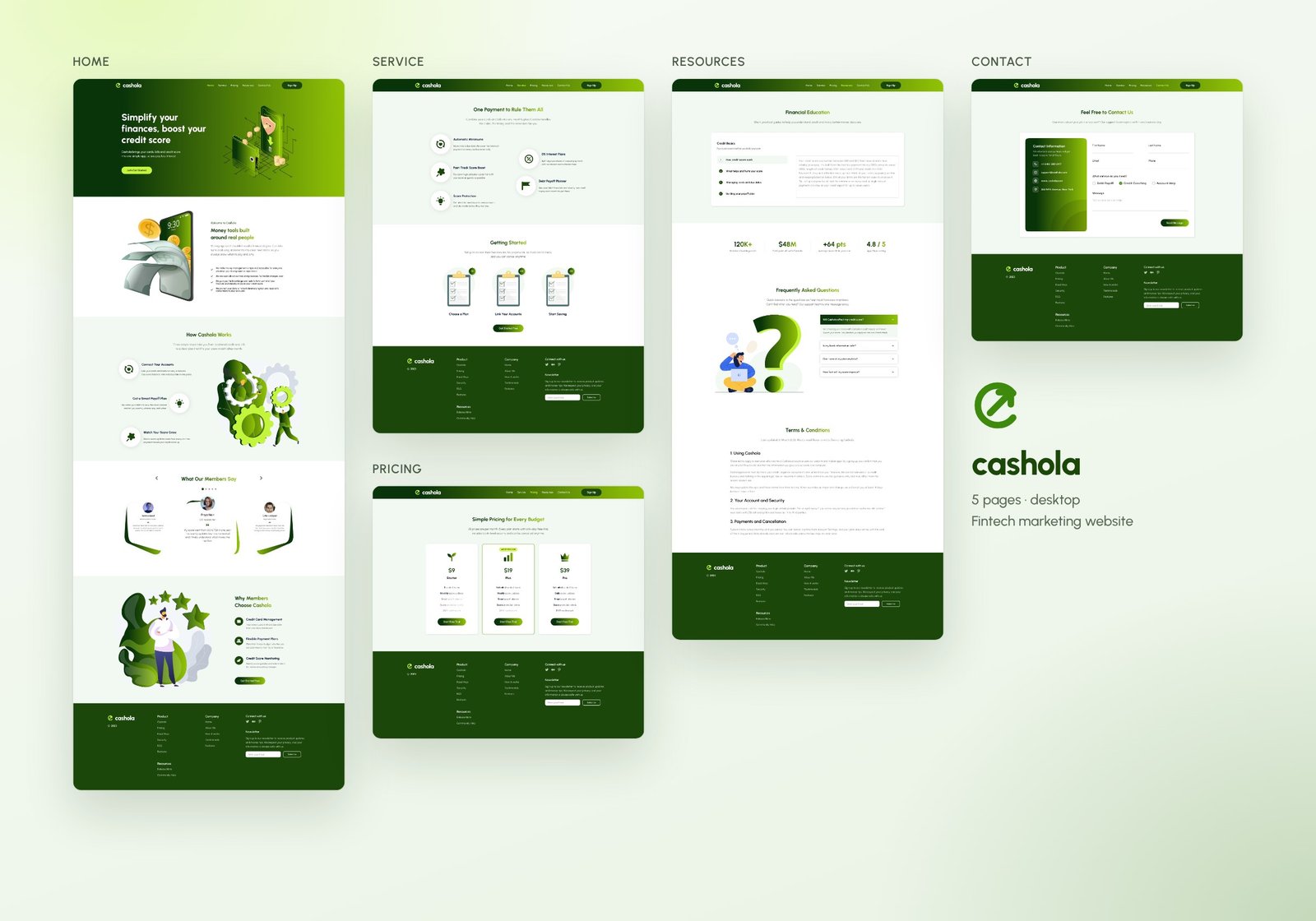
One story from top to bottom. The homepage follows the visitor's questions in order: what is this, how does it work, does it work for people like me, and why should I choose it. Each section answers one question and ends close to a call to action.
A green brand built around growth. We moved away from the usual fintech blue to a deep forest green with a bright neon-lime accent. Green says money and growth, and the 3D illustrations make the topic feel lighter.
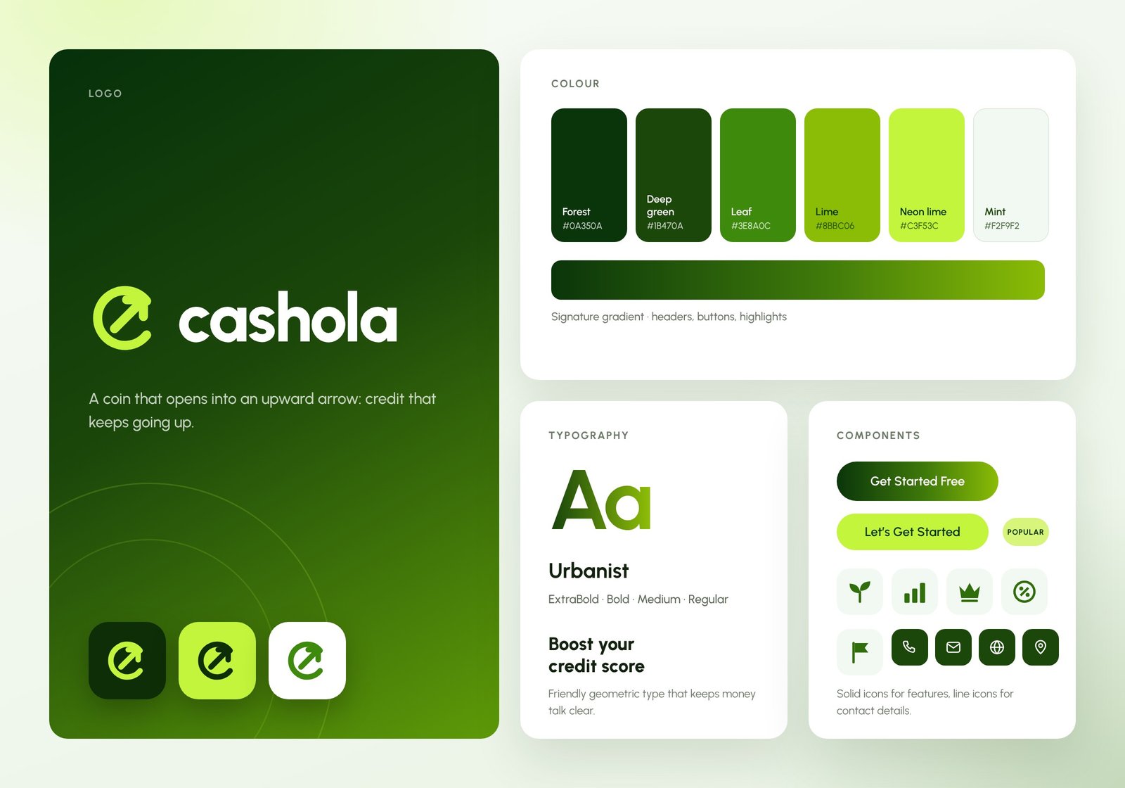
A logo with a meaning. The new mark is a coin that opens into an upward arrow: credit that keeps going up. It works as a full logo in the header, as an app icon, and on both dark and light backgrounds.
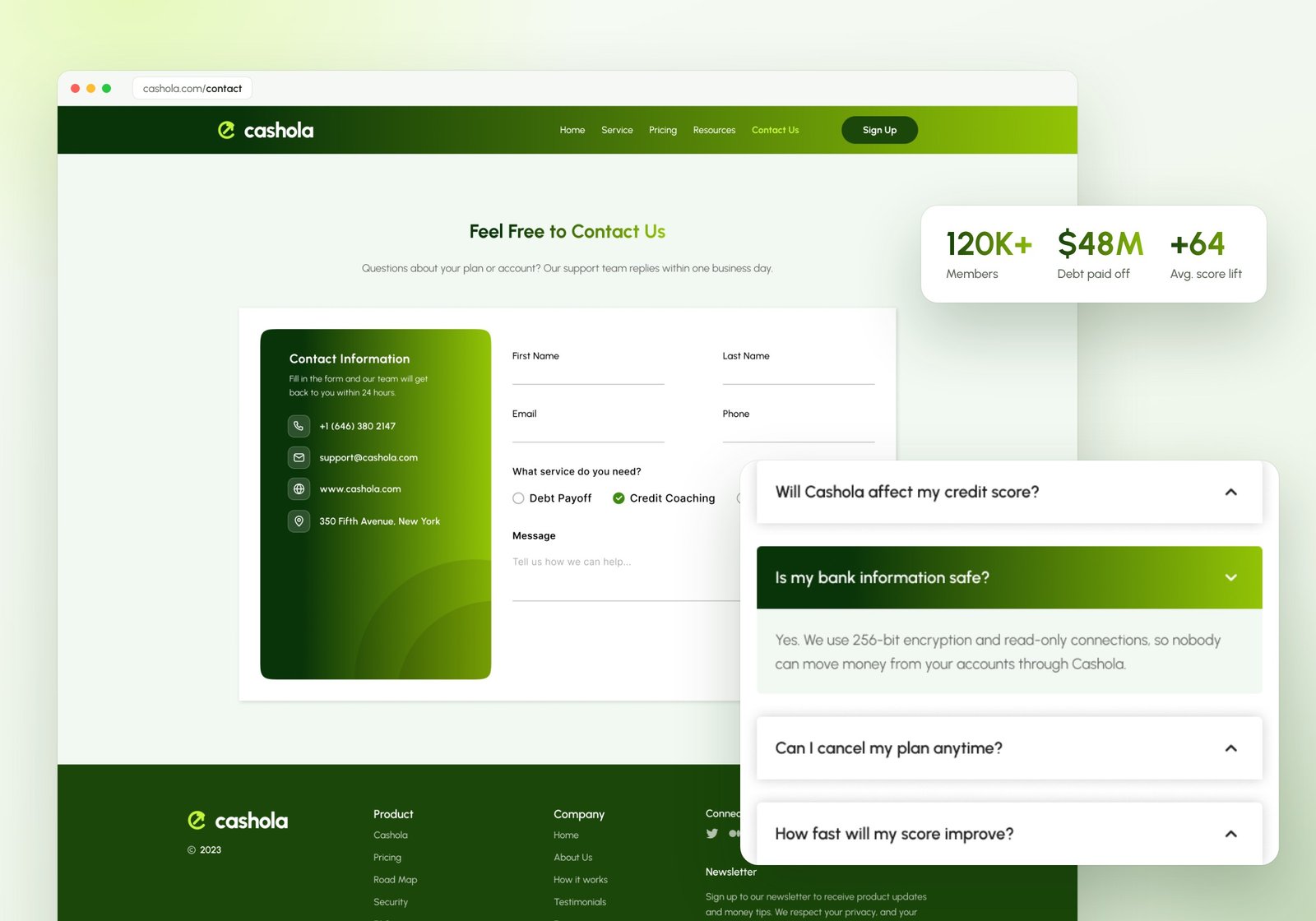
A small, consistent design system. One typeface (Urbanist) in four weights, a six-colour palette with a signature gradient, pill-shaped buttons, solid icons for features and line icons for contact details. Every page is built from the same parts, so the site feels like one product.
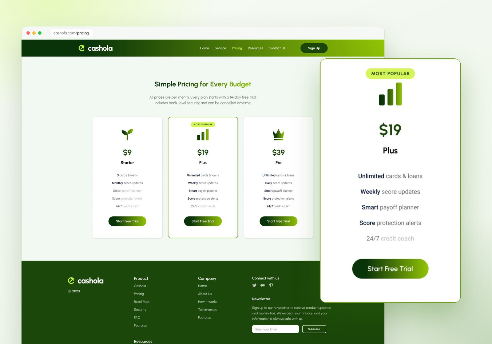
Clear, honest pricing. Three plans (Starter, Plus and Pro) show exactly what each one adds, with the middle plan highlighted as the most popular choice. Features a plan doesn't include are greyed out instead of hidden, so nothing feels like a trick.
Real copy, not filler. Every headline, testimonial and FAQ was written for the product, so the design could be judged with real content in place.
The outcome
A complete five-page marketing website (Home, Service, Pricing, Resources and Contact) plus a refreshed brand identity: logo, colour palette, typography, buttons and icon set.
All pages share one header, footer and component set, so new pages can be added quickly and still look consistent. The result feels approachable and premium at the same time, and gives Cashola a brand that stands out in a crowded fintech market.
- 5
- Pages designed
- 13
- Page sections
- 6
- Brand colours
- 1
- New logo & design system
Next project
Have a project
in mind?
Tell us what you're building. We'll get back to you within one business day.
Start a project