WEB DESIGN
Civic & Co
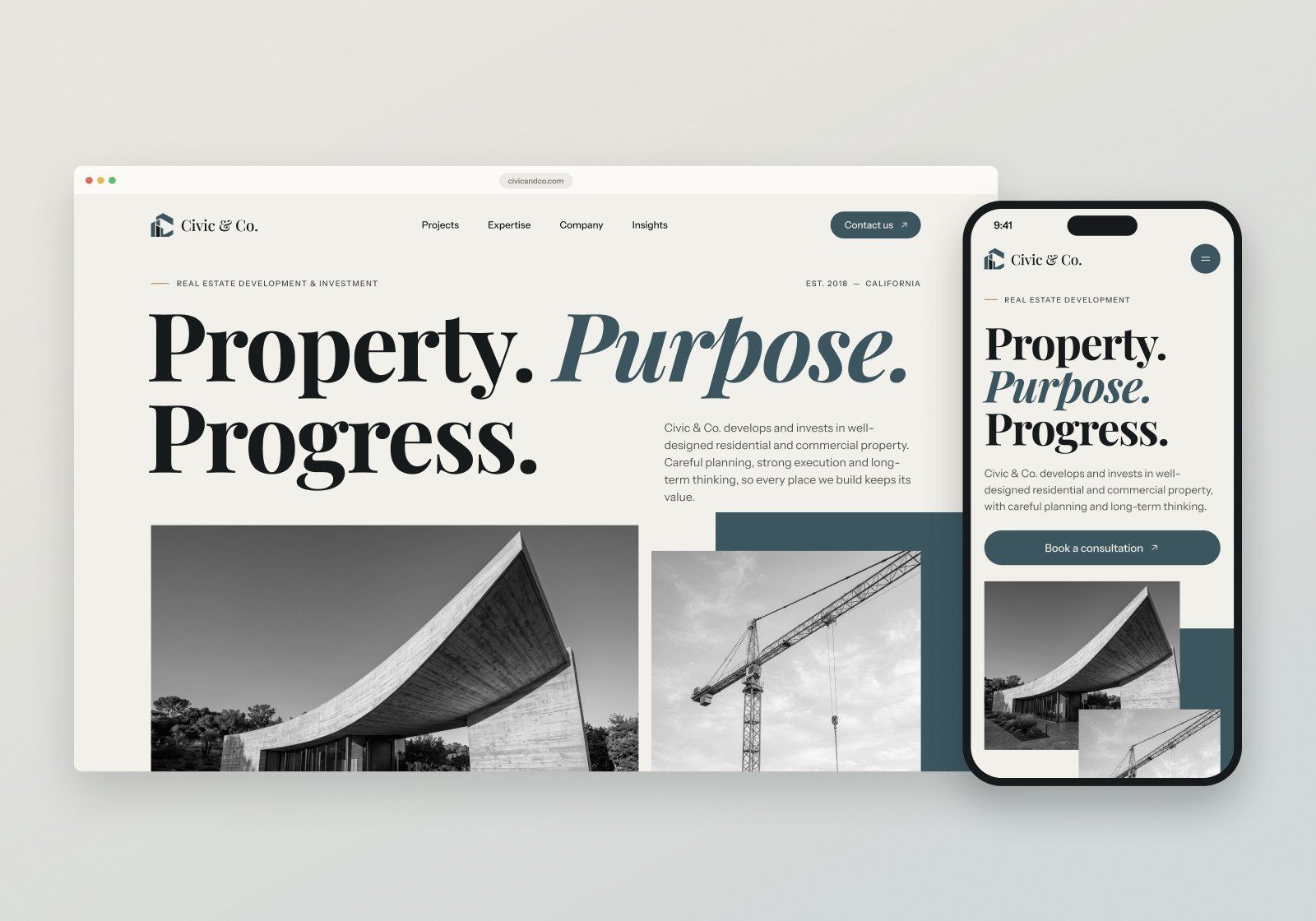
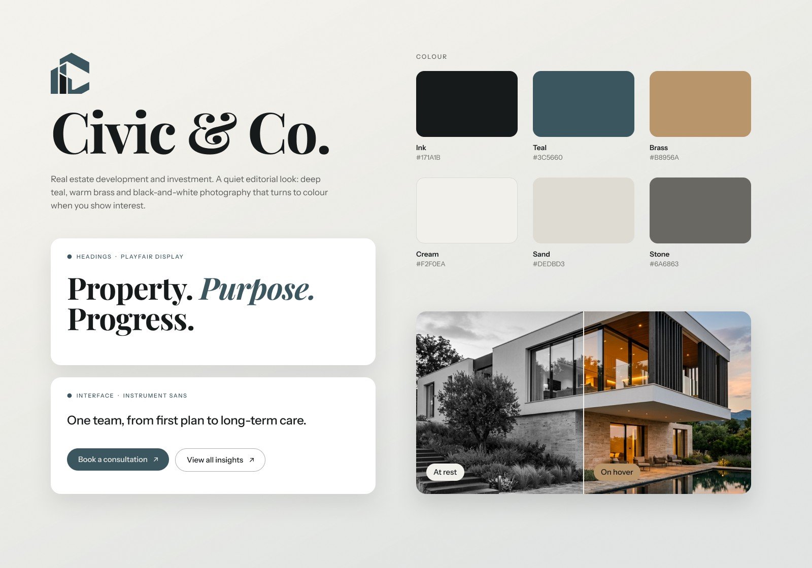
A homepage for Civic & Co., a real estate development and investment company in California. Designed for desktop and mobile with a bold editorial serif, a deep teal and brass palette, and black-and-white photography that turns to colour the moment you show interest.
The challenge
Real estate websites tend to fall into two camps: glossy brochures full of stock skylines and sales talk, or plain corporate pages that say very little about the buildings themselves. Neither builds the kind of trust a landowner, investor or future homeowner needs before picking up the phone.
Civic & Co. covers development, investment, project strategy and asset management under one roof. The homepage had to feel premium and calm, put real work in front of people early, explain four services without a wall of text, and give every visitor a clear next step, on a laptop or on a phone.
Our approach
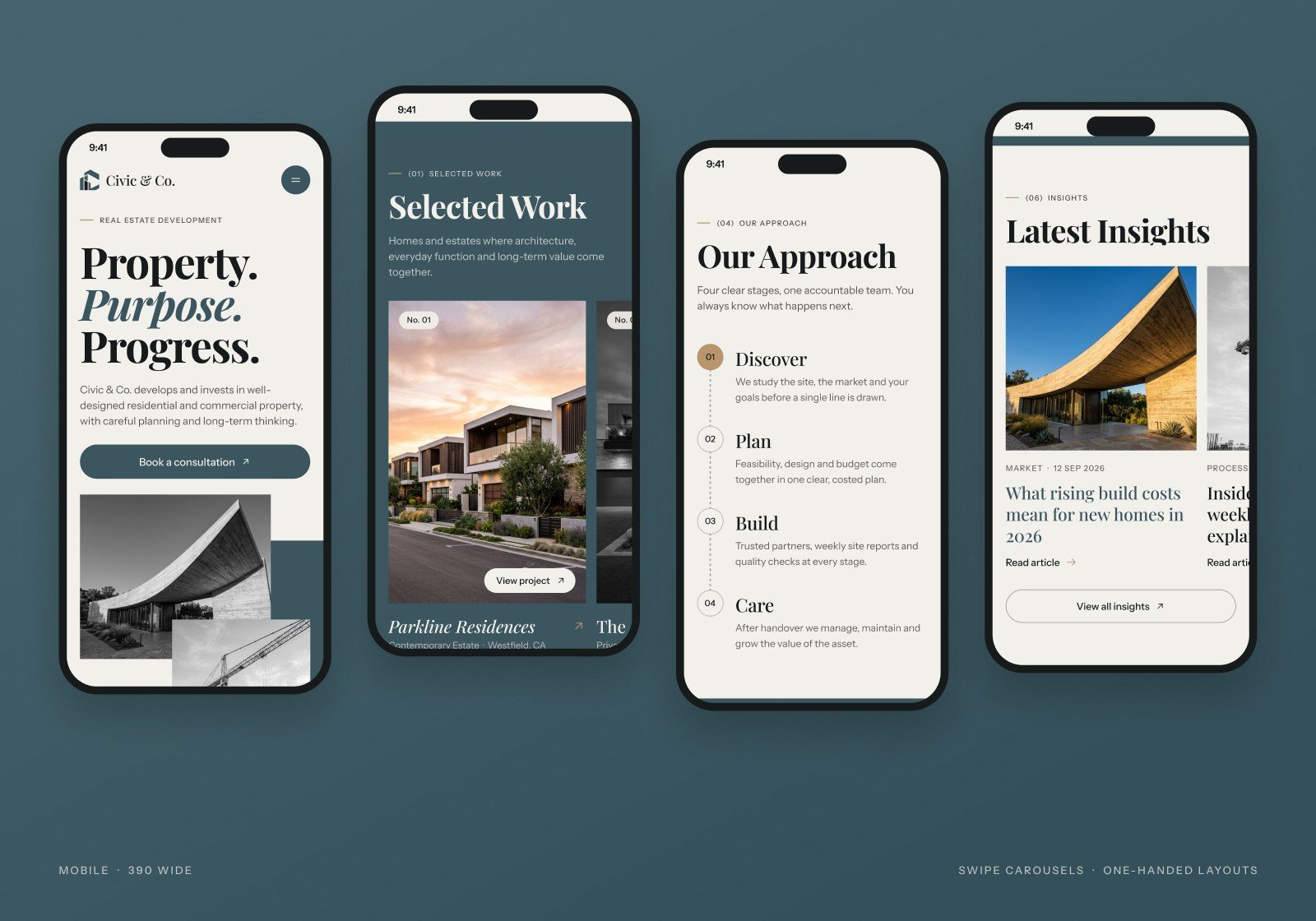
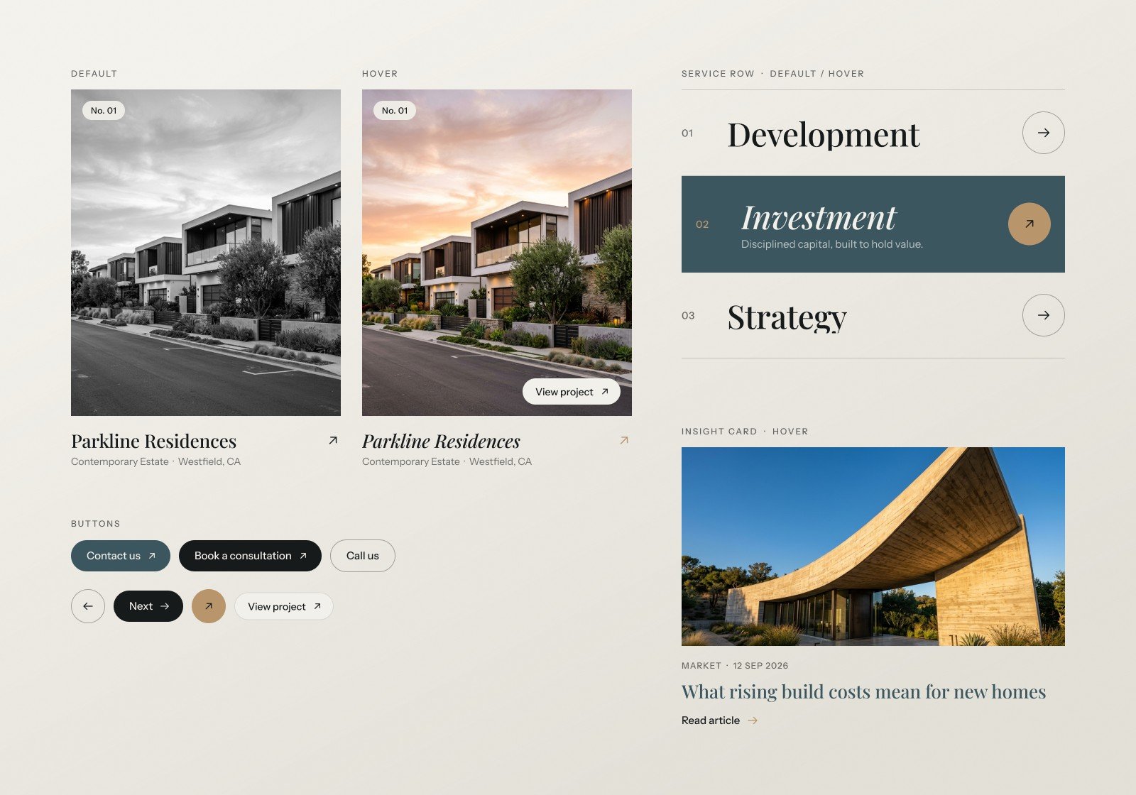
Black and white at rest, colour on interest. Every photo sits in black and white, so the page reads as one calm, editorial piece. Hover a project and it fades into full colour with a slight zoom and a "View project" pill. On mobile, where there is no hover, cards colour in as they scroll to the centre of the screen.
An editorial type system. Playfair Display sets large, confident headlines, with one italic word picked out in teal or brass, like "Purpose." and "lasts.". Instrument Sans keeps navigation, labels and body copy clear, and small numbered eyebrows such as "(01) Selected Work" guide the reader through the page like chapters.
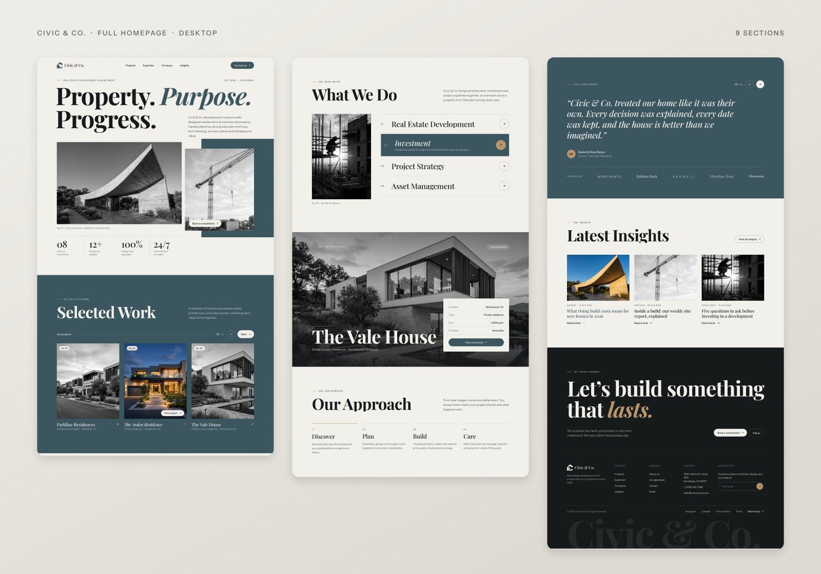
Work first, then the how. The page answers questions in the order a client asks them: what have you built, what do you do, show me one properly, how does it work, can I trust you, and how do I start. That becomes Selected Work, four services, The Vale House spotlight with location, size and timeline, a four-step approach, client words with partners, and a closing call to action.
A calm, deliberate palette. Deep teal and warm brass on a soft cream, with ink for the closing section. Full-width teal bands mark the key moments instead of scattered shapes, and brass is saved for small accents: arrows, active states and the one italic word in the final headline.
Rebuilt for one hand on mobile. On a 390px screen the headline stacks over three lines, project and insight cards swipe sideways, services become tappable rows, the four steps run down a dashed timeline, and the footer settles into clear groups. Every section was rebuilt for the phone, not just shrunk.
The outcome
A complete homepage for desktop (1440) and mobile (390) with nine sections: hero, selected work, what we do, featured project, our approach, client words, insights, a closing call to action and a footer.
The design is built from a small set of reusable pieces, including project cards, service rows and insight cards, each with a default and a hover state, plus pill and circle buttons, so future pages like Projects and Insights stay consistent. A 26-second showcase video brings the scroll and colour-on-hover behaviour to life.
- 9
- Homepage sections
- 2
- Layouts: Desktop & Mobile
- 3
- Components with hover states
- 6
- Colours in the palette
Next project
Have a project
in mind?
Tell us what you're building. We'll get back to you within one business day.
Start a project