In this article
- 1. A Clear Purpose and Strong First Impression01 / 09
- 2. Clear Visual Hierarchy02 / 09
- 3. Simple and Intuitive Navigation03 / 09
- 4. Consistent Branding and Professional Visual Design04 / 09
- 5. Responsive Website Design Across Devices05 / 09
- 6. Fast Loading and Smooth Interactions06 / 09
- 7. Strong Calls to Action That Encourage Action07 / 09
- 8. Trust, Credibility and Accessibility08 / 09
- 9. Useful Content and a Conversion-Focused Structure09 / 09
- Common Website Design Mistakes to Avoid
- When Should You Invest in Professional Website Design?
- Frequently Asked Questions
- Build a Website That Works as Well as It Looks
The most effective website designs combine clear messaging, intuitive navigation, visual hierarchy, responsive layouts, accessibility and thoughtful conversion paths. Every element should serve a purpose, whether that means explaining a service, answering a question or encouraging someone to make an enquiry.
For businesses, the difference between an attractive website and an effective one is how well it supports both customer needs and business objectives. Here are nine essential principles that make a website genuinely effective.
1. A Clear Purpose and Strong First Impression01 / 09
Visitors should understand what your business does and why it matters within a few seconds of arriving.
Your homepage should communicate three things:
- What your business offers.
- Who your products or services are for.
- What visitors should do next.
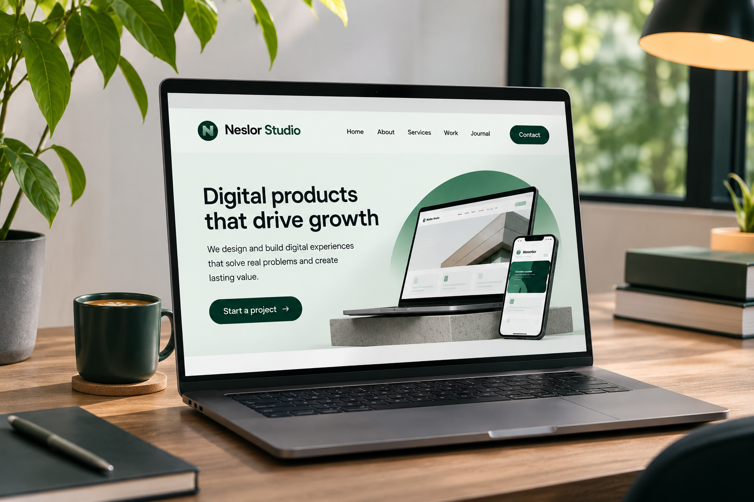
A strong hero section typically includes a meaningful headline, a short supporting description, a relevant visual and a clear call-to-action button.
For example, a web design agency should communicate its website design services and the value it provides rather than relying on a vague headline such as “Creating Digital Experiences.”
2. Clear Visual Hierarchy02 / 09
Visual hierarchy determines how visitors process information on a page. It helps them identify important messages, understand relationships between elements and decide where to look next.
Without hierarchy, even well-written content can become difficult to navigate. Use these elements strategically:
- Typography: Larger headings establish importance and organize content.
- Spacing: Consistent whitespace separates sections and improves readability.
- Contrast: Distinct colors highlight important information and interactive elements.
- Alignment: Consistent positioning creates structure and visual balance.
- Scale: Important elements should receive appropriate visual emphasis.
For example, a service page should make its primary heading more prominent than supporting descriptions. Its main CTA should also be visually distinguishable from secondary links. Good website design best practices prioritize clarity over unnecessary decoration.
3. Simple and Intuitive Navigation03 / 09
Navigation should help visitors find information without making them think too hard. When menus contain too many options, unclear labels or complicated dropdowns, visitors may struggle to understand where to go.
A practical navigation structure for a business website might include:
- Home
- Services
- About
- Work or Portfolio
- Contact
Use descriptive labels instead of creative wording that visitors might misunderstand. Keep important pages accessible, make the logo link to the homepage and ensure navigation works consistently across desktop and mobile devices.
4. Consistent Branding and Professional Visual Design04 / 09
A professional website design should communicate the personality and credibility of the business. Colors, typography, imagery, icons and graphic elements should work together as a consistent visual system.
For stronger brand consistency:
- Choose a primary and complementary color palette.
- Limit typography to a manageable font system.
- Use consistent button and link styles.
- Maintain predictable spacing between sections.
- Select imagery that supports your brand positioning.
Consistency is more important than using the latest visual trends. A financial technology company, for instance, may require a different visual direction from a creative studio or an independent retail brand. The objective is to create a recognizable experience that feels appropriate to the business and its audience.
5. Responsive Website Design Across Devices05 / 09
A website should work naturally on smartphones, tablets, laptops and desktop screens. Responsive website design adapts layouts, typography, images and interactive elements to different screen sizes.
However, responsiveness is more than shrinking a desktop layout. A properly considered mobile experience should include:
- Readable typography without unnecessary zooming.
- Buttons large enough to interact with comfortably.
- Navigation that works on smaller screens.
- Images that resize without breaking layouts.
- Forms that are easy to complete.
- Content that remains accessible and understandable.
Google uses the mobile version of website content for indexing through mobile-first indexing and recommends responsive design as an implementation approach.
6. Fast Loading and Smooth Interactions06 / 09
Website performance directly influences how comfortable a website feels to use. Visitors should not have to wait unnecessarily for important content or experience unexpected layout movements while browsing.
Google's Core Web Vitals provide three useful performance measurements:
| Metric | What it measures | Good target |
|---|---|---|
| LCP | Loading performance | 2.5 seconds or less |
| INP | Interaction responsiveness | 200 milliseconds or less |
| CLS | Visual stability | 0.1 or less |
To improve performance:
- Compress and optimize images.
- Use modern image formats where appropriate.
- Avoid unnecessary scripts and animations.
- Load only the resources your pages need.
- Choose suitable hosting and implementation technologies.
- Prevent images and other elements from shifting unexpectedly.
A visually impressive website is not effective if its performance makes the experience frustrating.
7. Strong Calls to Action That Encourage Action07 / 09
A call to action (CTA) tells visitors what they can do next. Without clear direction, visitors may understand your services but still leave without contacting you.
Effective CTAs use specific, action-oriented language. Examples include:
- Book a Consultation
- Request a Quote
- Explore Our Services
- Start Your Project
- Get in Touch
Place your primary CTA where it naturally supports the visitor's decision, such as the hero section, relevant service descriptions and the closing section of a page. Avoid placing multiple competing buttons together without establishing a clear priority.
8. Trust, Credibility and Accessibility08 / 09
Visitors need reasons to believe that your business can deliver what it promises. A professional website should make credibility easy to evaluate.
Useful trust elements include:
- Genuine customer testimonials.
- Relevant portfolio projects.
- Detailed service information.
- Team and company information.
- Clear contact details.
- Transparent processes and expectations.
Accessibility is equally important. Use sufficient text contrast, descriptive link labels, meaningful image alternative text, properly structured headings and visible keyboard focus indicators. These practices help make websites easier to use for people with different abilities and browsing requirements.
Trust should come from genuine evidence, not exaggerated marketing claims or fabricated testimonials.
9. Useful Content and a Conversion-Focused Structure09 / 09
Good design cannot compensate for unclear or unhelpful content. Visitors need enough information to understand your services, evaluate their options and make informed decisions.
A well-structured business website often follows this journey:
- Introduction: Explain what the business does.
- Problem: Identify the customer's needs or challenges.
- Solution: Explain how your services help.
- Benefits: Show the practical value of working with you.
- Proof: Present relevant projects, experience or testimonials.
- Action: Give visitors a clear way to get started.
This approach creates a logical connection between information and conversion. It also makes your website easier to maintain because each section has a defined purpose.
Common Website Design Mistakes to Avoid
Even well-intentioned design decisions can make a website harder to use. Watch out for these common problems:
- Prioritizing visual effects over usability.
- Using vague headlines that do not explain the service.
- Creating complicated navigation structures.
- Ignoring mobile layouts during the design process.
- Using inconsistent typography and spacing.
- Adding too many competing calls to action.
- Publishing oversized images that slow down pages.
- Hiding essential information behind unnecessary interactions.
A useful rule is simple: if an element does not improve understanding, usability, trust or functionality, reconsider whether it belongs on the page.
When Should You Invest in Professional Website Design?
A professional website redesign may be worth considering when your existing website no longer reflects your brand, visitors struggle to understand your services, mobile usability is poor or your pages fail to guide potential customers toward meaningful actions.
The process should begin with understanding your business objectives and audience.
At Neslor Studio, website projects follow a structured approach:
Discover → Define → Design → Build → Launch
The team first understands your goals and users, defines the scope and appropriate platform, creates the website experience, develops and tests it, and prepares it for launch. By keeping design and development together, Neslor aims to reduce the disconnect that can happen when one team designs a website and another builds it.
If you are planning a new website or improving an existing one, explore our Web Design Services to see how a thoughtful, user-focused approach can support your business.
Free 30-minute call
Not sure where to start?
Tell us what you are building. We will say what we would do first, and what it takes.
Frequently Asked Questions
What makes a website design good?
Good website design combines clear messaging, intuitive navigation, visual consistency, responsive layouts, accessibility and reliable performance. Most importantly, it helps visitors find information and complete their intended actions.
What are the most important website design principles?
The essential principles include clarity, visual hierarchy, simple navigation, consistent branding, responsive design, fast performance, accessible interfaces, strong calls to action and useful content.
How does website design affect conversions?
Website design influences how easily visitors understand an offer, evaluate credibility and complete an action. Clear messaging, relevant proof, intuitive navigation and strategically positioned CTAs can reduce friction throughout the decision-making process.
Why is responsive website design important?
Responsive design ensures that content and functionality adapt to different screen sizes. It improves usability across devices and supports Google's mobile-first indexing approach.
What is the difference between UI and UX design?
UX design focuses on the overall experience, including usability, information architecture and user journeys. UI design focuses on the interface itself, including typography, colors, buttons, layouts and interactive elements. Both work together to create an effective website.
How often should a business redesign its website?
There is no universal redesign schedule. Consider updating your website when your business objectives, branding, services, technology or customer needs change. Regular performance and usability reviews can help identify when improvements are necessary.
Build a Website That Works as Well as It Looks
A successful website is not defined by appearance alone. It is defined by how effectively it communicates, builds confidence and helps visitors move forward.
At Neslor Studio, we believe in clarity over decoration and thoughtful execution from the first design decision to the final launch.
Explore Web Design Services
